Love the wallpaper. Can you remember where you got It?
@glen I made it! From a few pieces  The picture on the wall is Thomas Kinkade Mountain Paradise, the globus is from this website https://www.geodus.com/en/antique-globe-am_GL025F.htm then you need to add a few shelves and floor, nails and ropes for hanging icons, board and pins, and last but very important detail add shadows in Photoshop for all objects, then it looks more realistic.
1 Like
Wow you did a great job! Thanks for taking the time to tell me.


Here’s Mine! I’m new to Linux (only been playing with it for a little over a week) but I’m enjoying tinkering and learning how to setup everything the way I like it.

3 Likes


Congratulations! nice desktop.
1 Like
the wallpaper is kind of hypnotizing me 
2 Likes
Hey there, a dumb question, but, does anyone know the name of the cursive font? I changed it and can’t find it in the typographies. It’s a default font. Thanks!
Karumbi maybe? I just know I really liked it against that wallpaper.
1 Like
Sawasdee Regular 75 and 32
1 Like
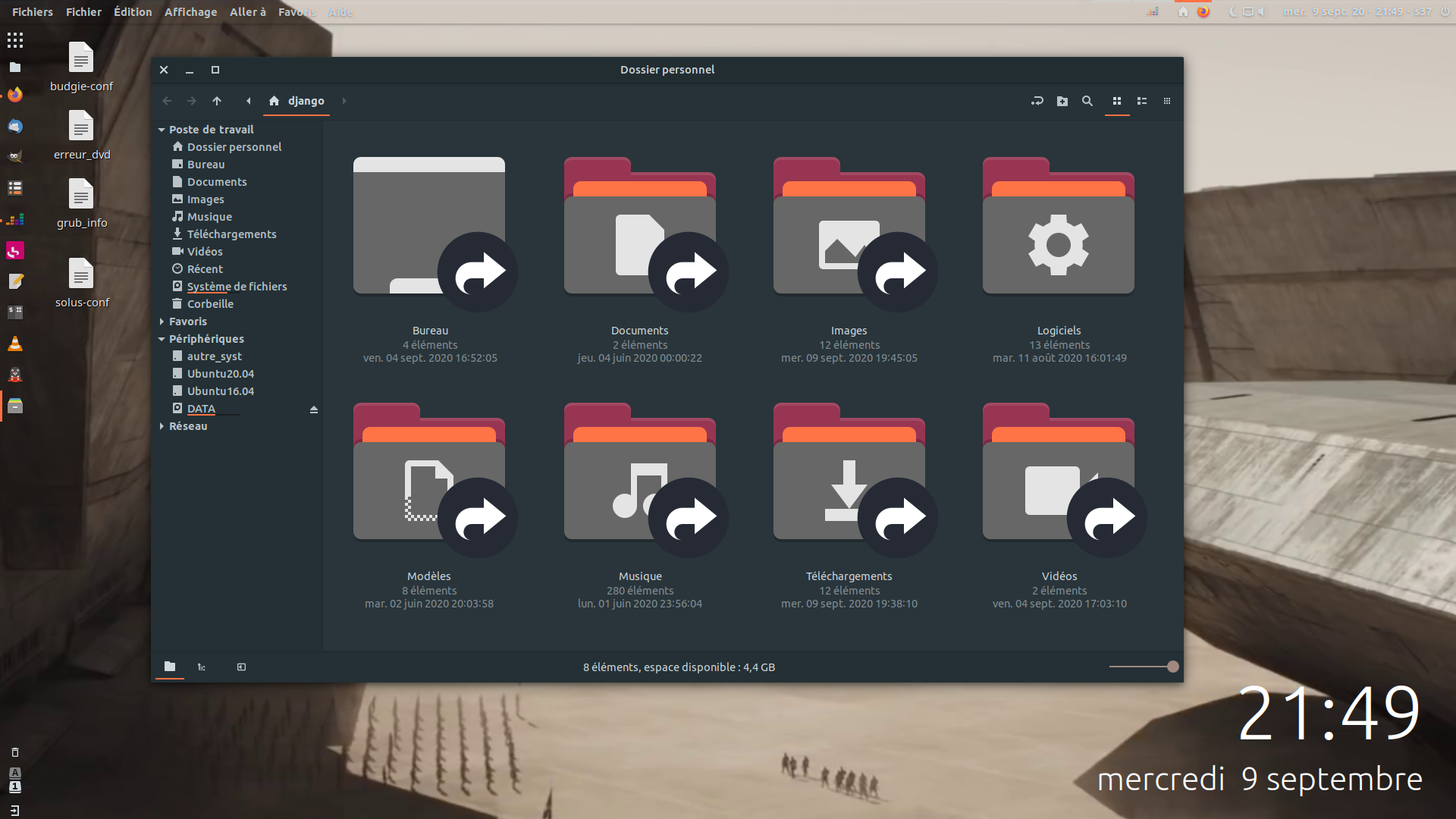
Desktop ( screenshot from Villeneuve’s Dune trailer ):

Chromium ( snap themed accordingly ) :

Settings ( and a recurrent bug ):

Top panel :

Left panel ( and raven ) :

Gimp ( snap ) :
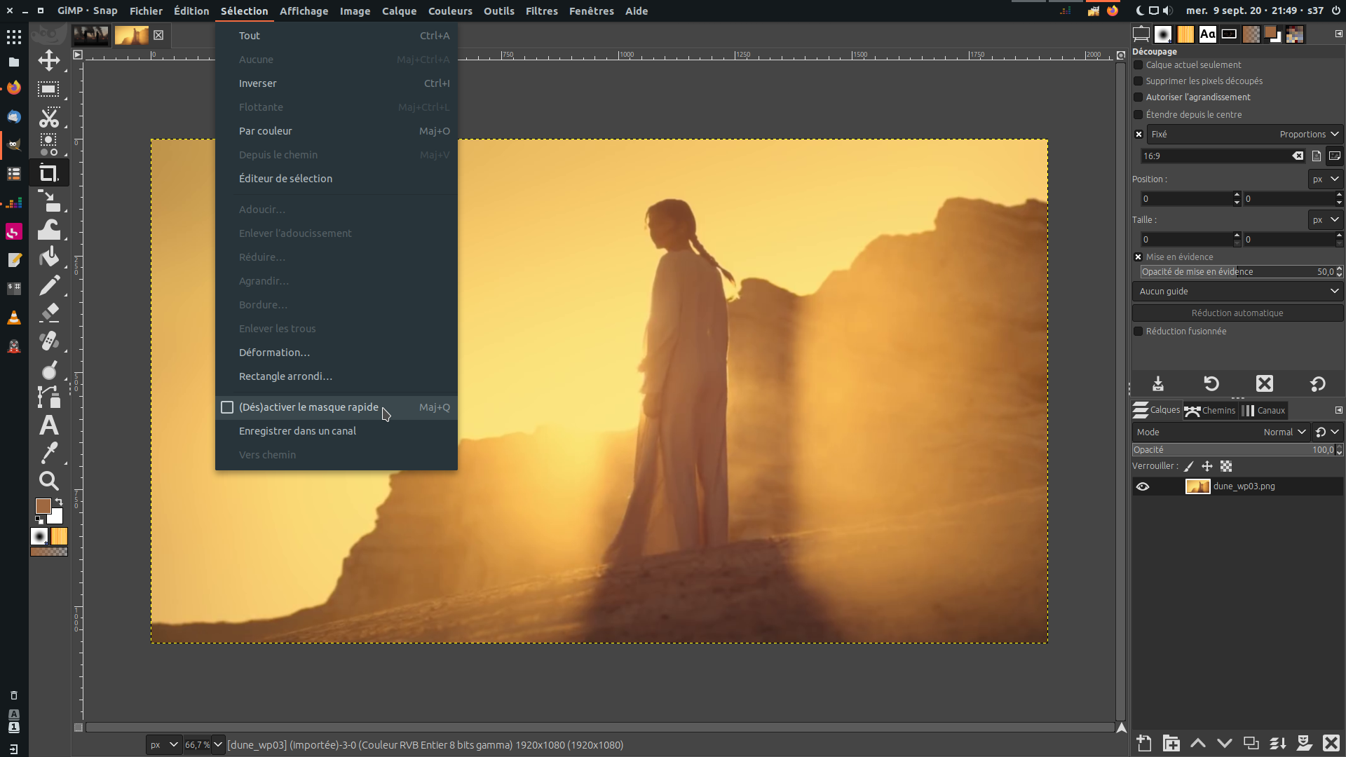
Nemo :
Too bad panel(s) color ( or font-color in panel ) are not auto-adaptative - I think pantheon/elementary does that.
and since I am at it :


3 Likes


Nice wallpaper … where did you get it?
Well, I am going to be the odd one I guess, but I will post it anyways. I’m middle aged I guess and experienced with all the OS’s and most of the desktop environments at one time or another. I can’t say that I liked a whole lot about any of them in stock form. But when I decided to start over, there were specific likes from many of them and I wanted to try to melt them all together, while not making it a long term labor of love either in case it got screwed up at some point. I think I put more effort into the top panel than anything?
For the desktop I kind of wanted a Fedora/Elementary/Mac/Budgie/Gnome 2 mash up look and function, with the pinning capability from the bottom task bar of windows, which I get with top bar and plank. The only part I ended up abandoning was the old school Gnome 2 Applications Places System menu. It is of course an option. I just ended up dropping it in the evolution process. Got rid of it once I knocked off the navigation rust because my kids didn’t want theirs that way and I wanted uniformity across our devices.
The background is a picture I took. The icons are Pocillo and sized accordingly so that I find them very similar to my iPhone and Android icons.

I use to Qogir Dark theme to be similar to iOS, Android, how I had Windows and how I started with 19.10 Budgie. I also greatly prefer the right hand window controls and windows looking buttons for controls.
Cursor is DMZ black
I was fine with the default file manager and learned how to set that up to my liking where I could pin in the left pane, etc. Only change I can recall there is that when I went to 20.04 I didn’t like the change to orange. Between here and github I figured out 19.10 Qogir Budgie dark was the same thing as Qogir Dark, which was changed to Qogir ubuntu in Budgie 20.04 which was were the orange came from. I didn’t like the change and it clashed with my red laptop. So I swapped the theme back. Blue was most neutral of the color options Blue, Green, Orange. No idea why there isn’t just a custom color picker.

Ubuntu Budgie allowed me to most easily tweak things to how we all wanted them.
5 Likes
Please drop those desktop icons already. They clutter your otherwise consistently tweaked desktop for no reason therefore ruining it. 
Never ! 
Sometimes my desktop is empty, sometimes not. See, it’s a desktop, sometimes a mess when I’m working on something, sometimes clean because all jobs are done.
It’s a kind of reminder, as this screen is the first thing I see when I wake up my computer. A place for works in progress or temporary things I know I will move or delete soon.
( and I always let some files standing there on purpose for screenshots, just to show people « usable » desktops still exist and matter, in spite of gnome/elementary castrating trends. )
1 Like
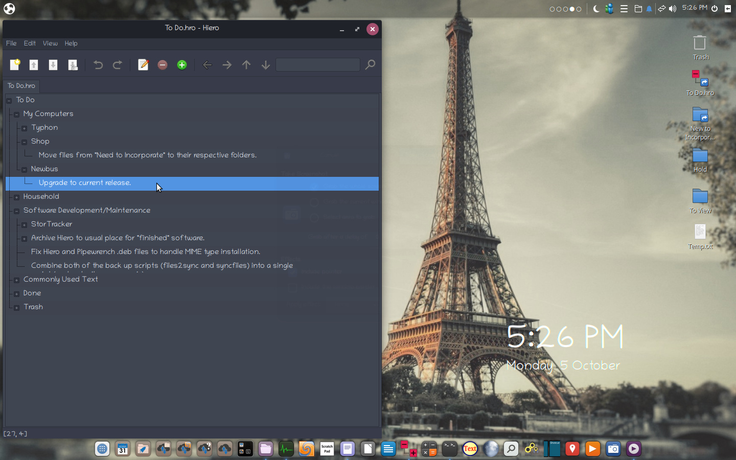
Lots of great desktops displayed on this thread. I may as well add mine to the mix… The only things that make my desktop at all unique is that I tend to use wallpapers that are either completely gray-scale or at least mostly desaturated. I like how this makes the desktop elements contrast with the background. The wallpaper I’m using here was desaturated except for the left face of the tower which enhances the appearance of either sunrise or sunset. Secondly, I use the Chilanka font for both window titles and as the interface font. Here, I simply wanted to rid the desktop as much as possible of the overly-utilitarian look of standard chosen fonts and provide a bit more personality. I originally tried using the Purisa font for this purpose but not only is it a bit too extreme, in general it takes too much vertical space.


3 Likes
And of course, there’s “My Ubuntu Budgie 20.04 Desktop,” the movie.
1 Like
Is there a way to automatically align icons on the right side of the desktop ?
Or did you just put icons there manually ?
It’s nice you explain your tweaks and choices and did a video !
1 Like